Photo 1
|
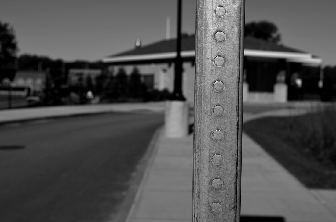
I selected this photo because of the use of foreground/middleground/background, and repetition. Compositionally, the metal rod represents the foreground of the image, and has a repeating pattern of circles along it. The middleground is located where the road and street light are; this section of the picture has a blurry effect because the foreground is the only part that's focused. Lastly, the background is where the snack shack and trees are positioned. To take this photo, I had the camera set on a 100 ISO and on a white balance of sunny. The picture was taken straight on, creating an interesting point of view, which captured different aspects of the image.
|
Photo 2
|
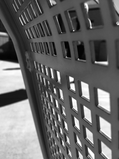
Looking at this photo, the compositional element that is most apparent are the leading lines that begin on the right side of the image, and end on the left vertical third. The use of pattern repetition is seen all throughout the chair. The square-like shapes frequently occur from the top of the picture, all the way to the bottom. When I edited this photo, I decided to transform it into black and white to give the image a dramatic appearance. The camera was set to ISO 100 and a white balance of sunny. This photo becomes abstract, meaning that the viewer doesn't quite know what the photo truly is.
|
|
Photo 3
|
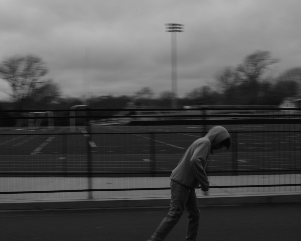
This photo was taken for the motion assignment.
The grayscale makes the photograph dismal, yet eye-catching. My point of view was straight on and about five feet away. The photo follows the rule of thirds because the subject is in the bottom third of the image. The camera was set to a slow shutter speed for panning, making the subject be in focus, and the background blurred. The ISO was set to 1600 and the White Balance was cloudy. |
Photo 4
|
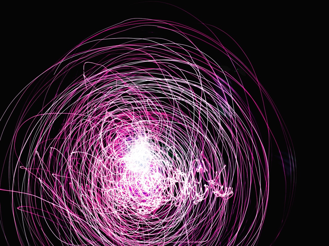
I selected this photo from the painting with light assignment. Compositionally, there is a lot of movement within this image because of the active light source (string lights) that created this interesting look. The use of lines captured the rapid activity that occurred when taking the photo. I had to set the camera on a slow shutter speed with an ISO of 200. Also, the white balance was on the setting of incandescent. I feel as though this picture gives off an outer space vibe, making the image more appeasing to the eye.
|
|
Photo 5
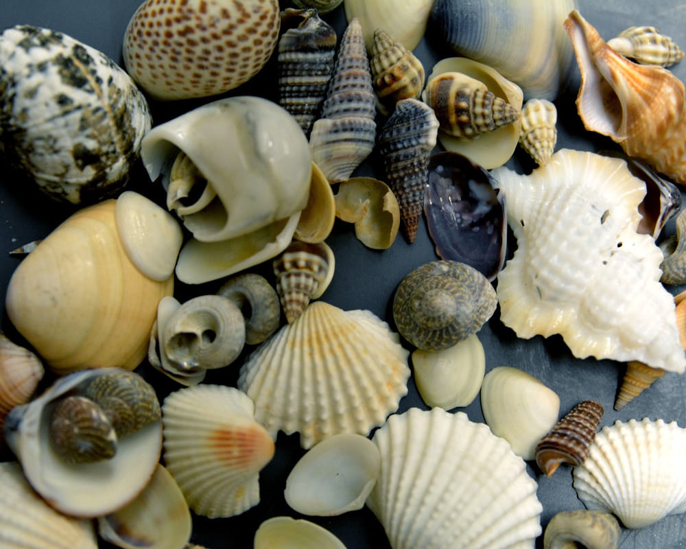
|
This photo was taken for the aperture assignment.
What I like about this photo is that there's great use of line and shape throughout the whole work. The texture seen within the shells makes the image 10x more appearing; as if you can physically touch them. My point of view was very close up/zoomed in, and straight on. The ISO was set to 400 and the White Balance was fluorescent. The variety of different colored shells, with different shapes, gives the photograph emphasis and meaning. |
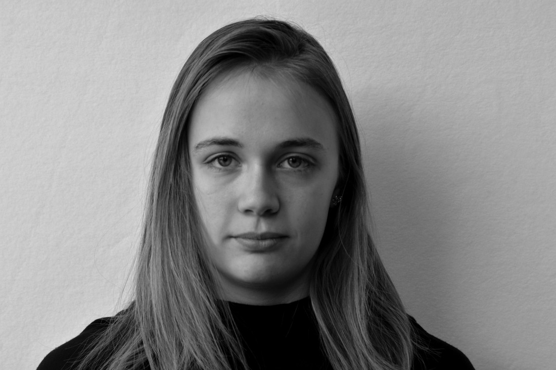
Photo 6
|
This photo was taken for the portraits assignment. What I like about this photograph is that the subject shows seriousness and a blank expression, creating a 10x more dramatic portrait. The use of positive and negative space allows the picture to be melancholy. My point of view was straight on, approx. 2 feet away. The ISO was set to 1600 and the White Balance was cloudy, due to the fact that the source of light was natural light coming from the window on the left-hand side.
|
|
